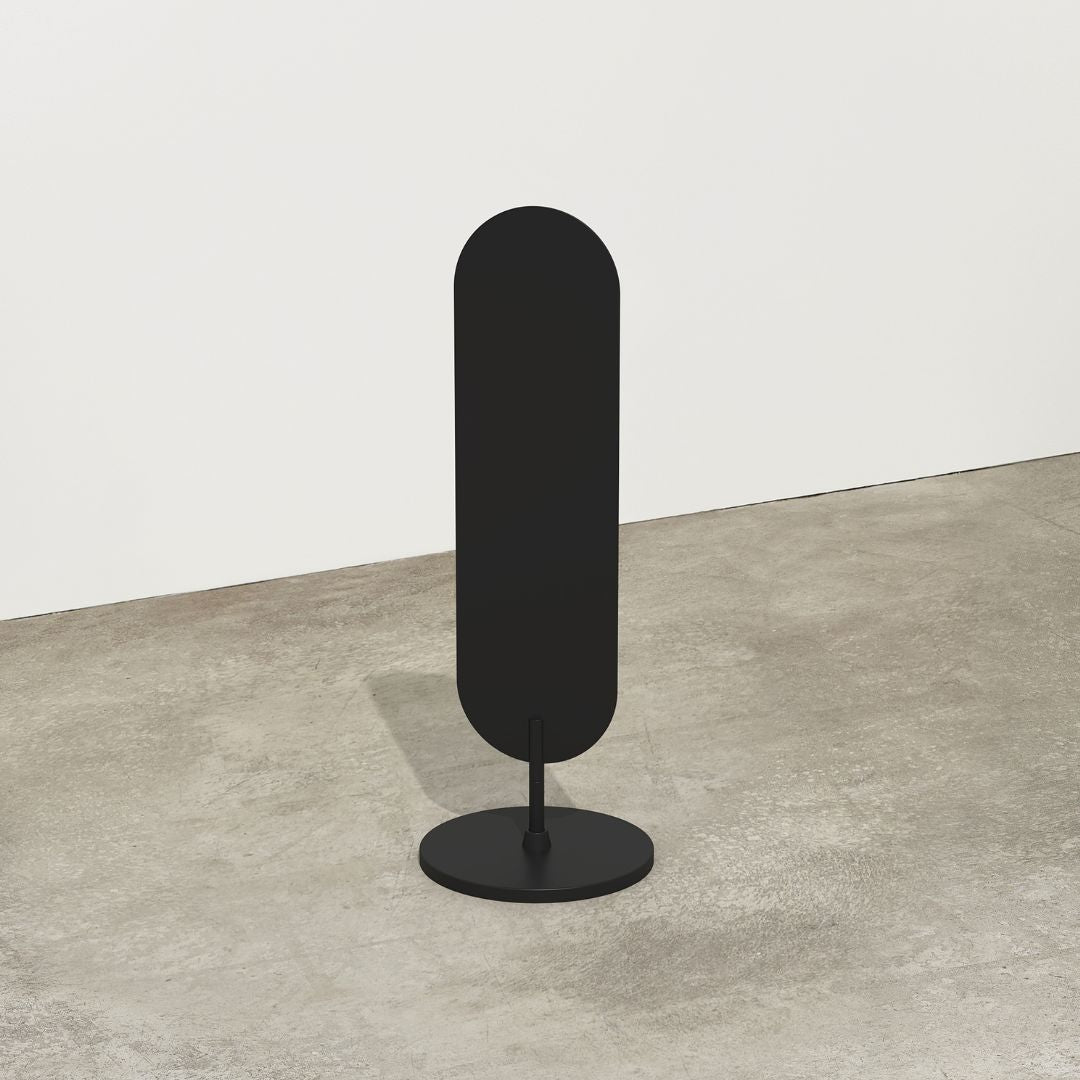
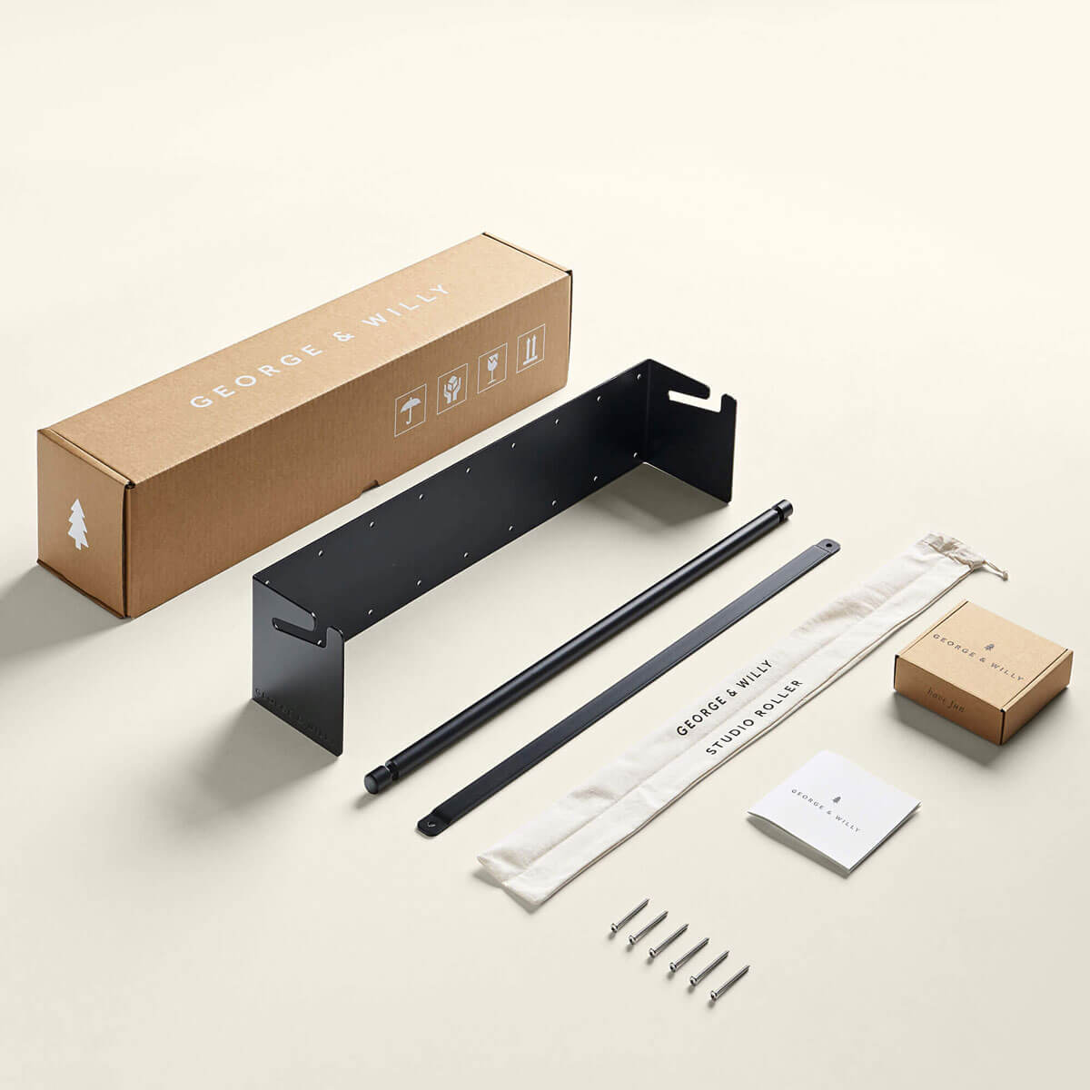
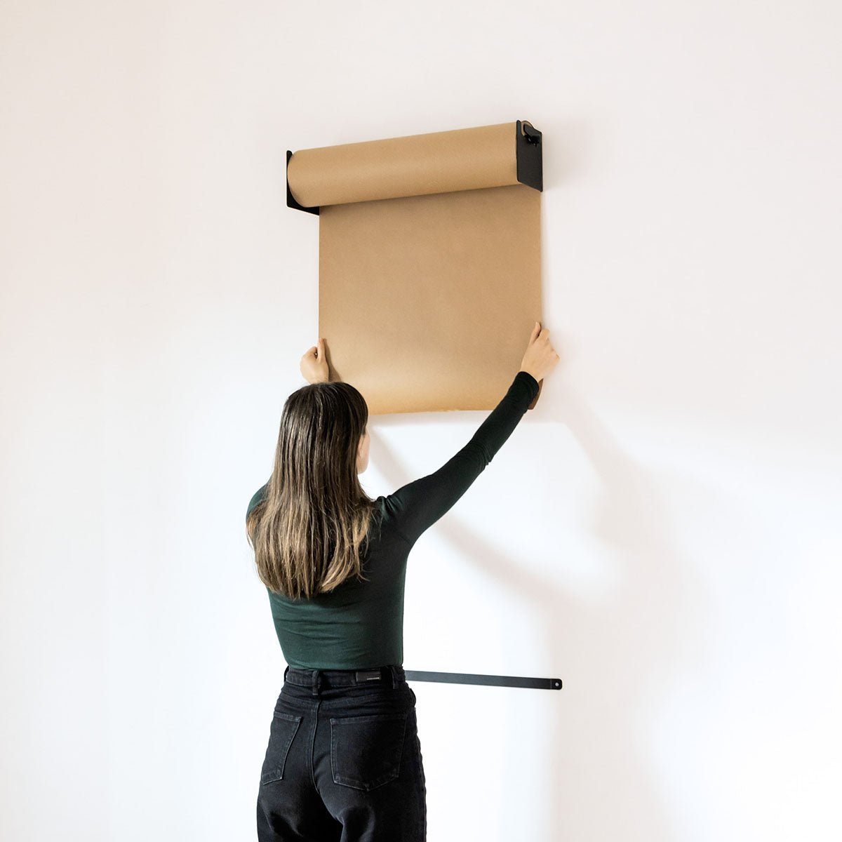
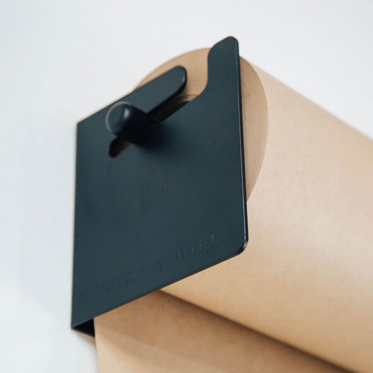
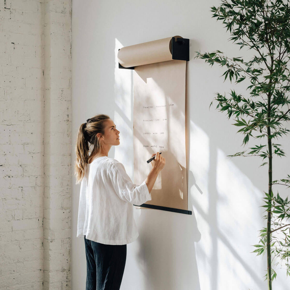
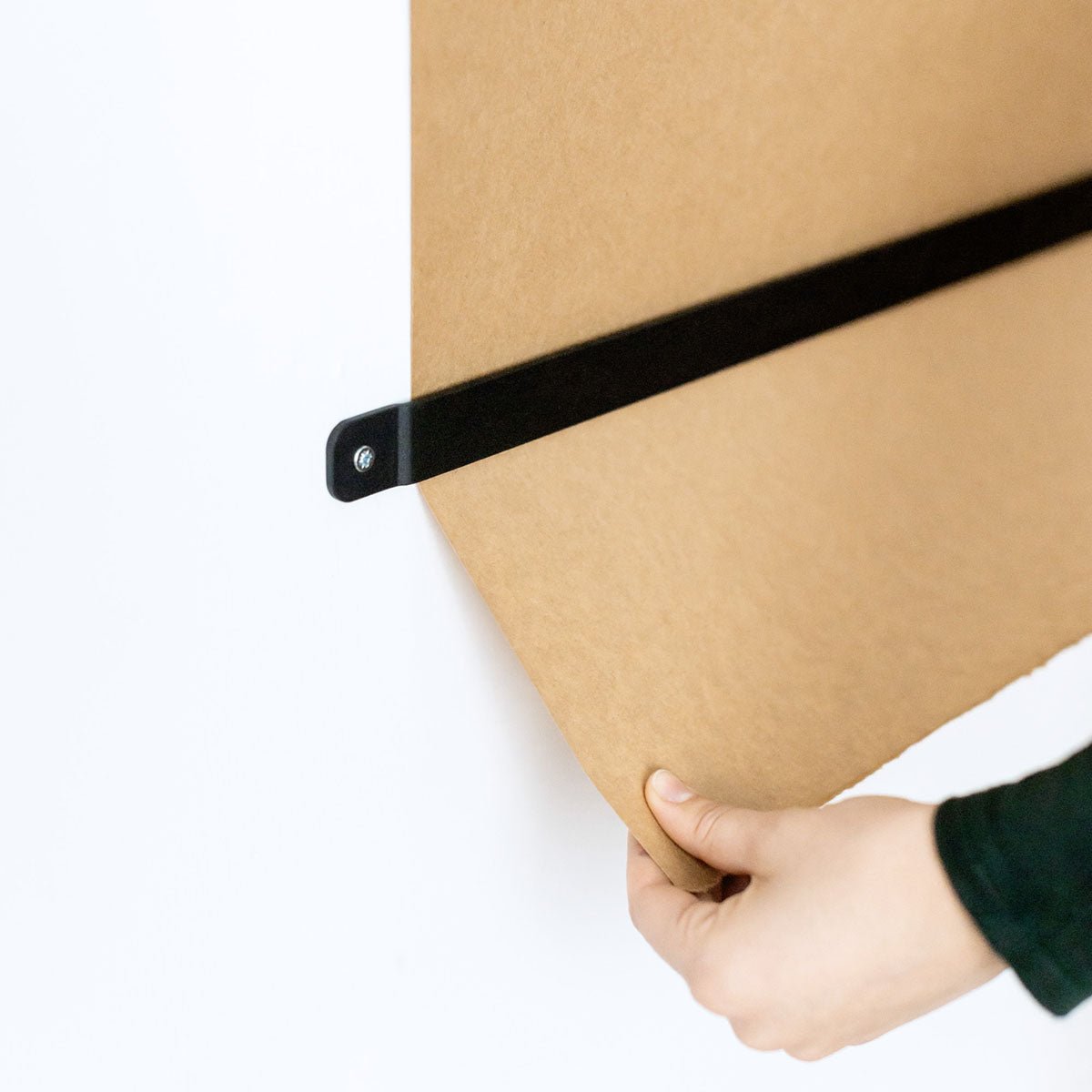
Meet Amanda Jane Jones. As the founding designers of Kinfolk magazine, Amanda designed what is one of our favourite publications from scratch, creating the beautiful look that it still beholds today. These days, Amanda is a freelance graphic designer, editor of Define Magazine and mother to a growing family. She's a big fan of George and Willy, with her most recent product, the Studio Roller, about to be added to her new arrivals bedroom. We catch up with her below...

Tell us a little bit about Amanda Jane Jones? I'm a freelance graphic designer and art director based on the south side of Chicago. I live here with my husband and two kids (one on the way in just a few short weeks!). I have a small home office and our favourite family activity is bike riding to the lakeshore together for a picnic or beach visit.

You co-founded Kinfolk, one of our favourite publications. What was the inspiration behind starting this magazine? Issue 13 was my last, so it's been a while! But Nathan reached out to me at the very beginning. He had a name and theme and that was about it! It was an amazing experience being able to design it from scratch and dream up something all on our own aesthetically. It was a wonderful experience to be a part of.

What prompted you to begin your latest magazine, Define? I was missing magazine design and as a freelancer wanted to create something for artists that could be a place for them to explore their craft without the client filter. Each issue had one theme and I was amazed at how little overlap we had among artists and such unique interpretations each time. We launched it a month before our second was due, so after four successful issues, we decided to put it on hold until our family got a little older. For now, it's a back burner project for the future!

What's the key to good design? I think it's ever-changing. My style has evolved and matured over the years for sure, but for me, it always comes down to solid typography well-distributed space. Good Imagery also can make or break a design - so it's important to work with good photographers that understand and share your vision.
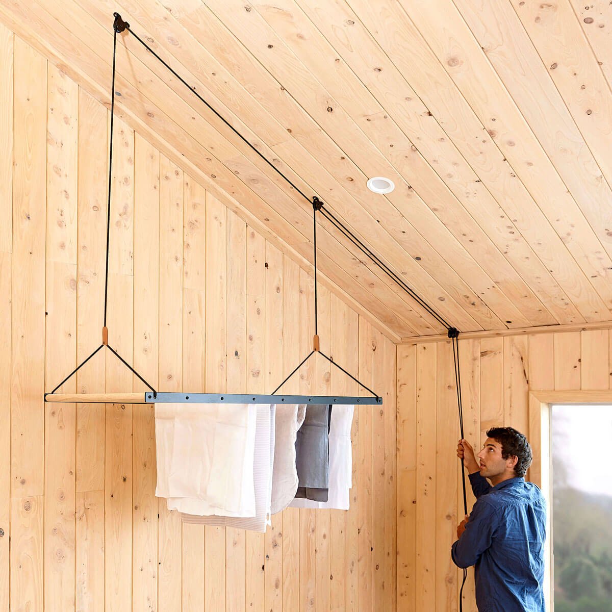
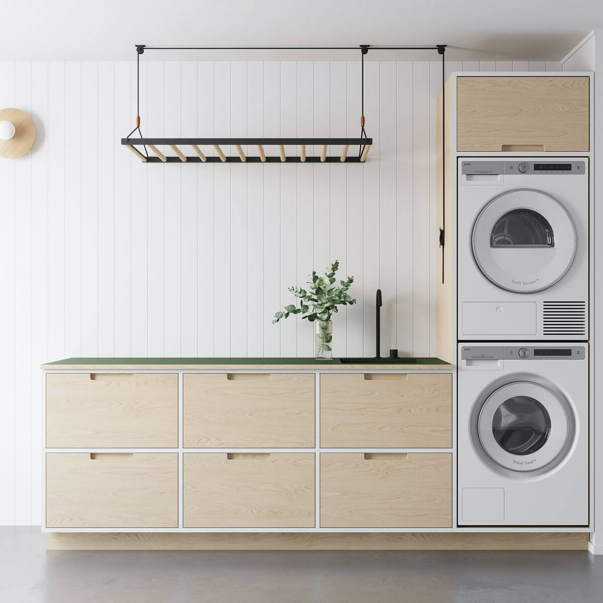
What do you like about the George and Willy aesthetic? It's simple, functional and beautiful all at the same time. For example, we used to stow our clothing racks in the closet when they aren't in use, but our G&W one looks so beautiful as is, we just leave it out, leaning against the wall until our next load of laundry is ready to hang. It feels more a part of our space and home rather than an eyesore that we can't wait to remove.
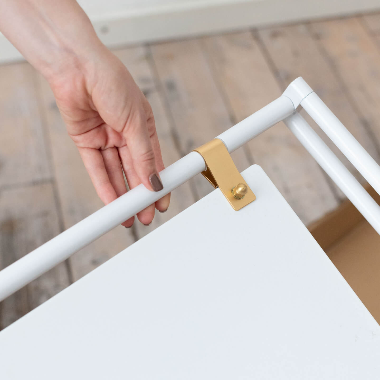
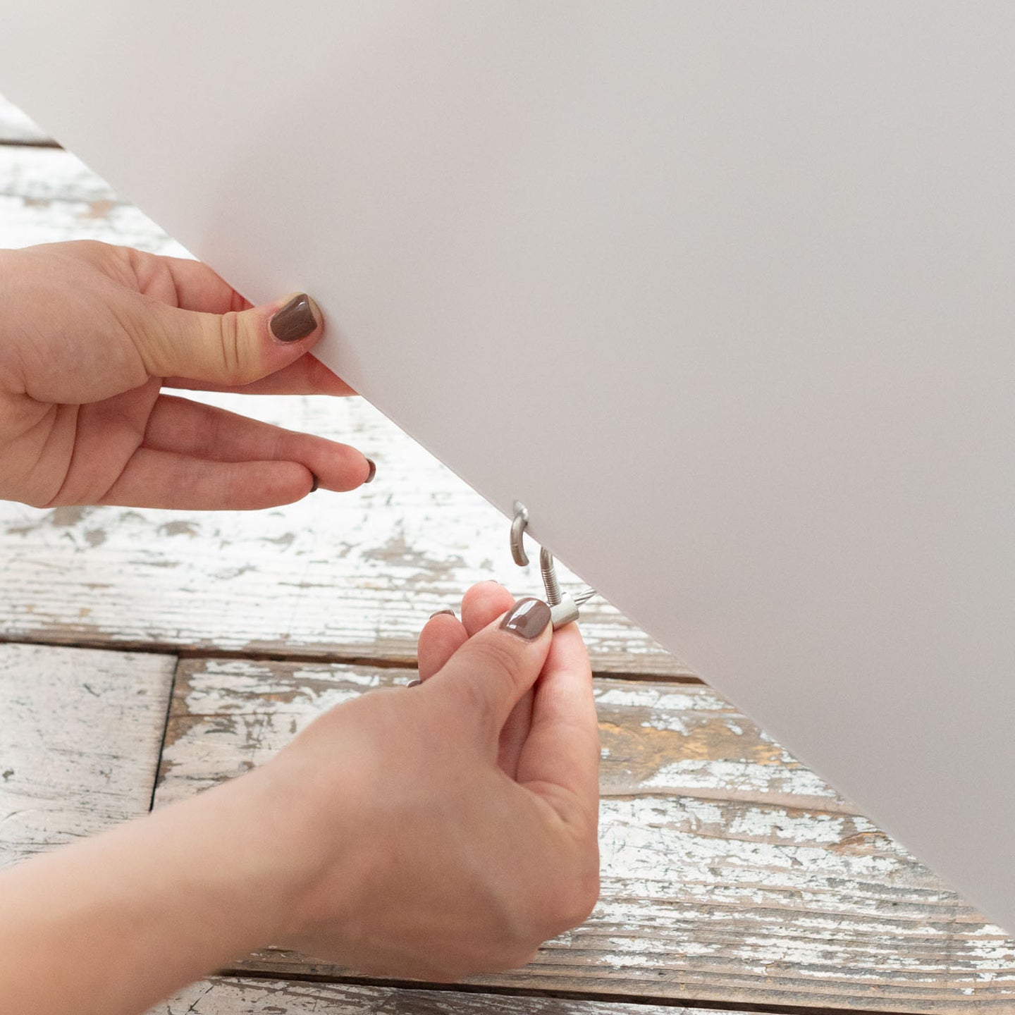
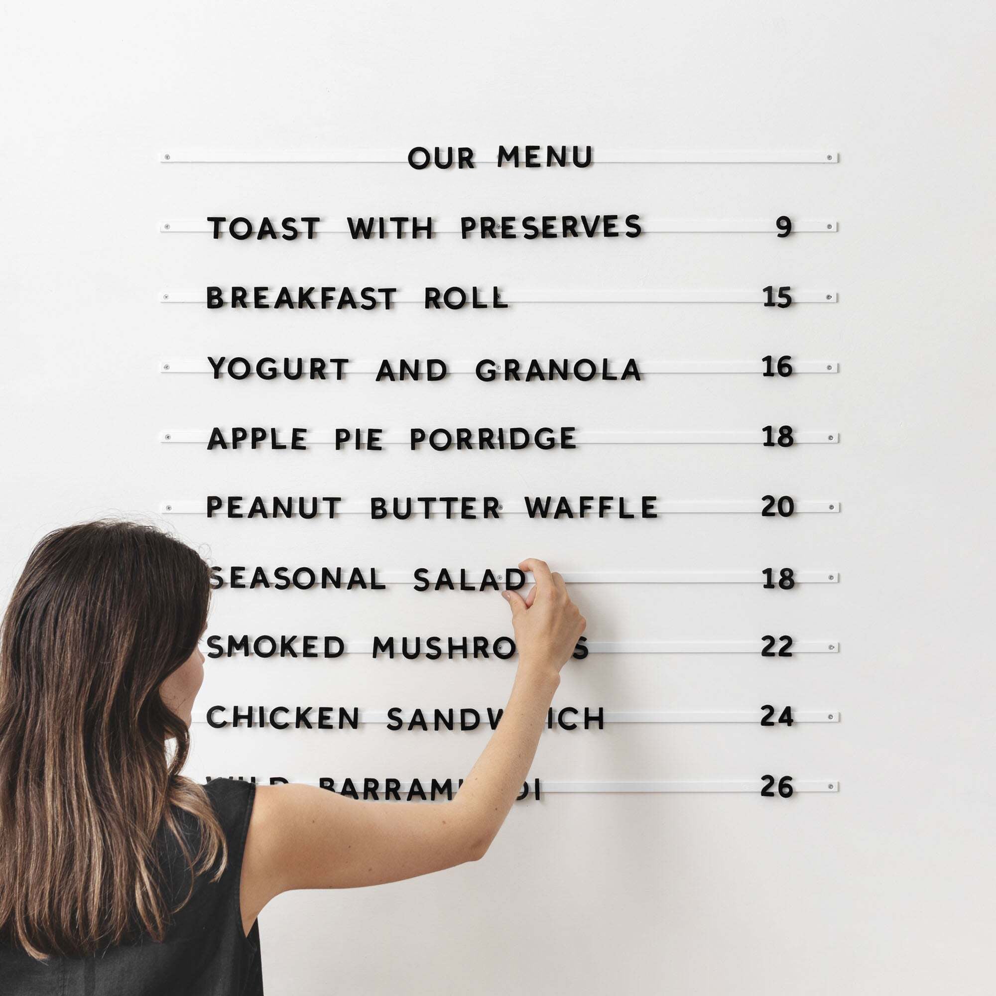
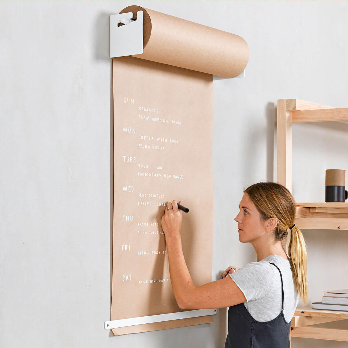
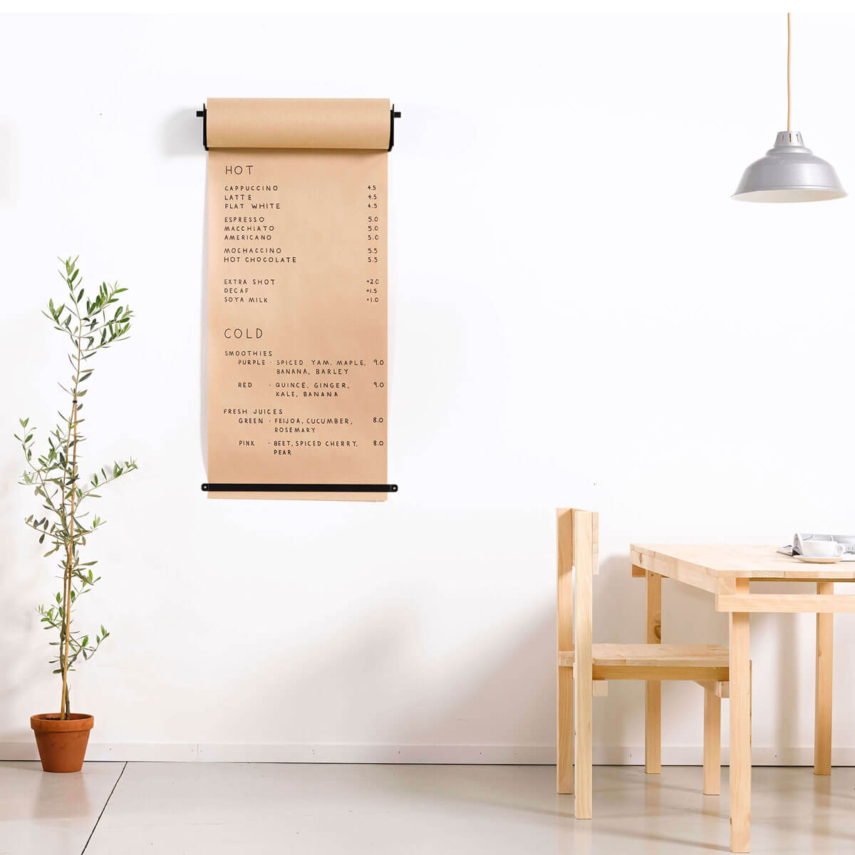
Which G&W products do you use regularly? We use the drying rack and the desk note roller almost daily - and we're currently in the process of hanging the paper roll in the kid's room as we re-design it for them to share before baby comes!

What would be your top tips for staying organised? Utilize your closet space and use a lot of containers! Everything has a space, a box or a basket in our home. This makes clean up so easy and for me, it also makes parenting so much easier. The kids know exactly where their toys and art supplies are and they know exactly where they go when they are done. We are always on the lookout for beautiful boxes and baskets to use for this purpose and have lucked out to find beautiful and unique ones that add to the aesthetic of our home rather than clutter our space.
How do you stay creative and keep your workplace inspiring? I keep an inspiration wall that I'm constantly adding to in my office. We also have a very large book wall in our dining room that's full of books from all over the world showcasing different artists - this is always a go-to for me. And of course, our lake! Honestly, when I'm in a design rut, the first thing I do is go for a walk with my kids or a run. Some of my greatest ideas have come while breathing in the lake air.

Photos courtesy of Amanda Jane Jones


