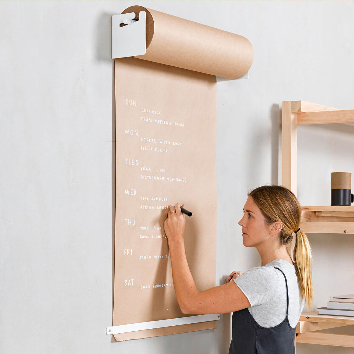
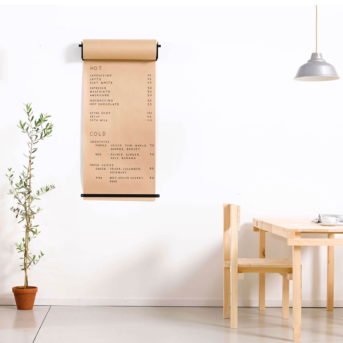
There is a global movement towards minimalist industrial style.
When you are looking to lease a space, the one with exposed brick and concrete will be more expensive than the one with brand new fresh white walls.
People love the industrial raw feeling of an old factory, a nod to the past - where the previous generation was loading ships or building cars, now home to the hottest coffee shop or restaurant.
Hospitality shops in these buildings are fitting their space out with antiques from decades ago. Enamel light shades, wired glass, corten steel, and workbenches.

But perhaps something more important to nail is the branding element for the coffee shop. The font for the menu is very important to complete the coffee shop.
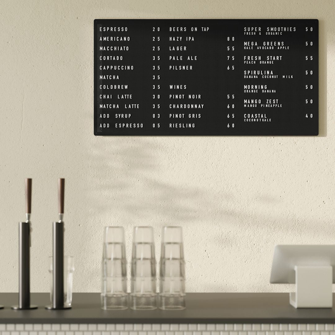
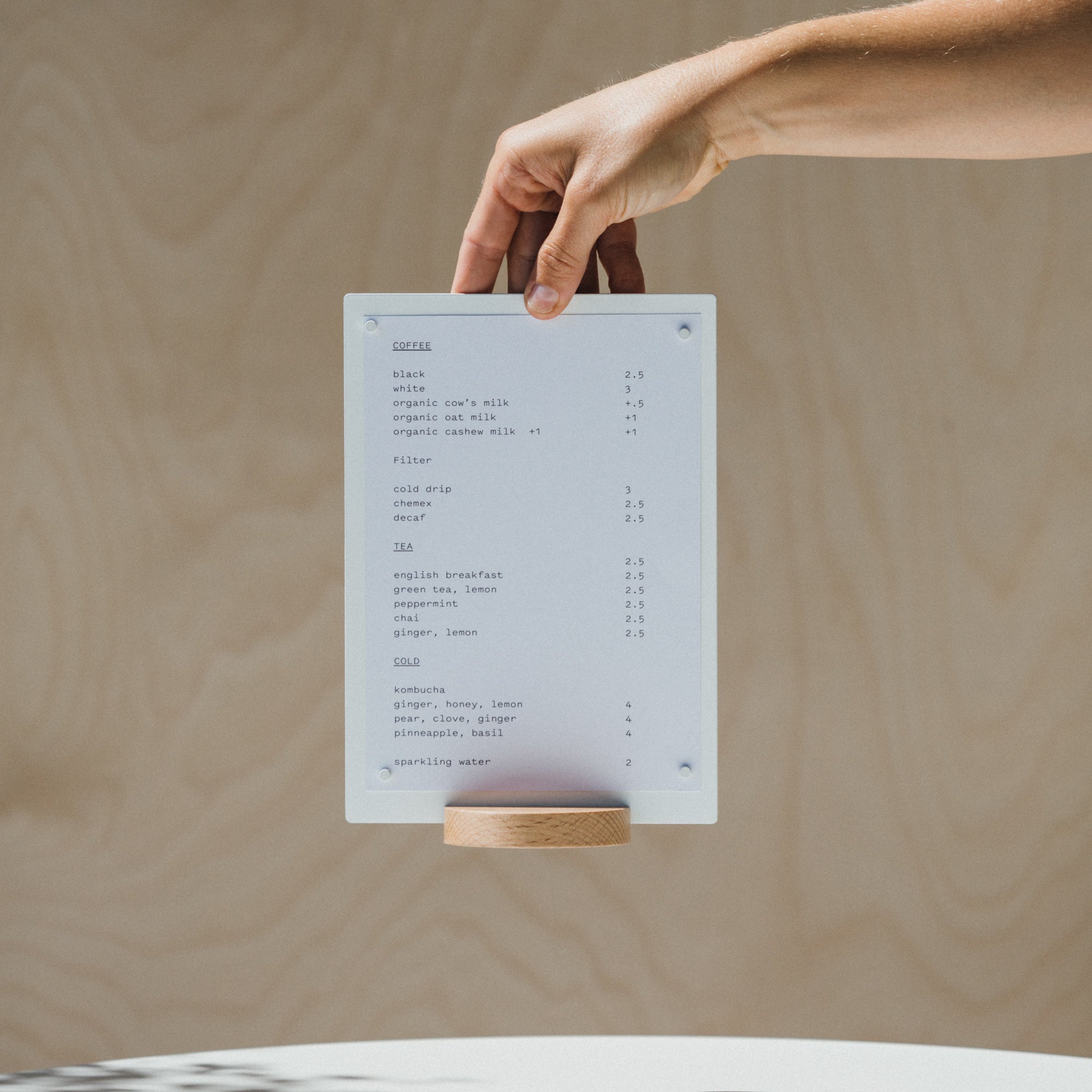
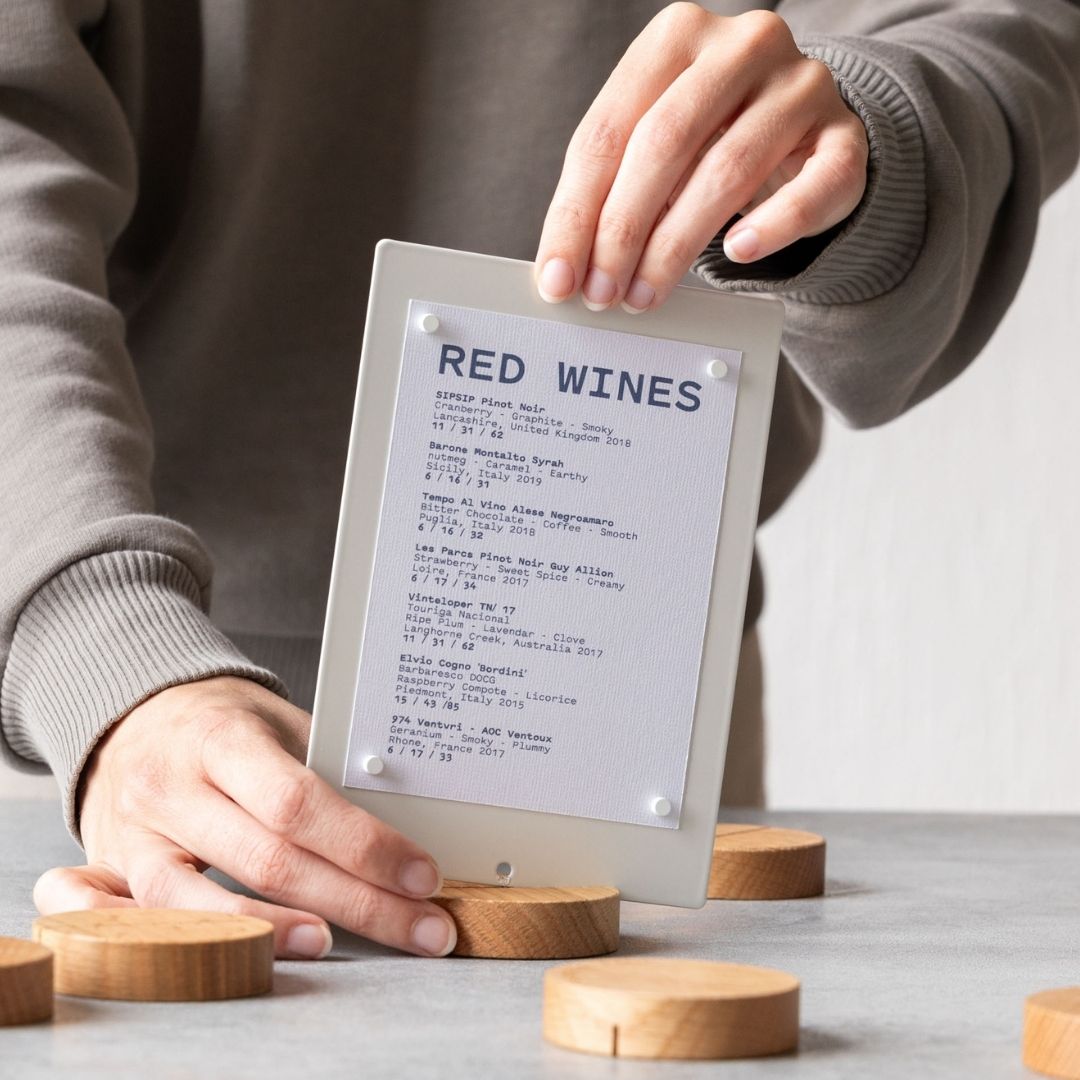
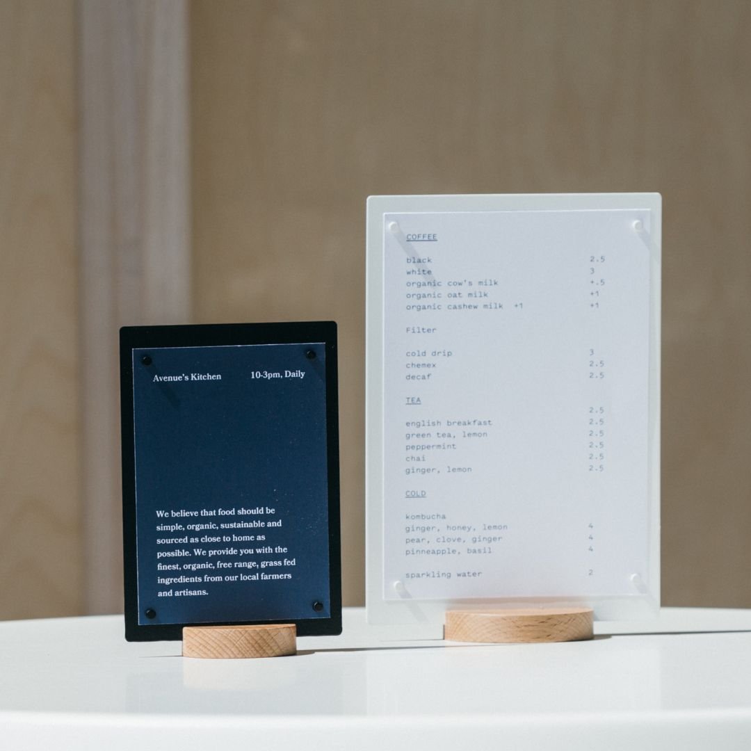
Industrial fonts are inspired by typewriters of sorts and punched serial numbers on machinery. They are stripped back to basics and are usually a mono font, which looks great on menus.
Mono is a good font for menus as it has that industrial style. Mono font means all of the letters are the same width - if you can imagine a typewriter or any punched font - the W must be the same width as the I.
Let's have a look at some industrial style fonts for menus which we have used in the past.
URW Geometric
A clean font for menus which suits lowercase. This font is the menu for my wedding which had the style of clean and paired back.

URW font on a clean wedding menu
Effra Medium
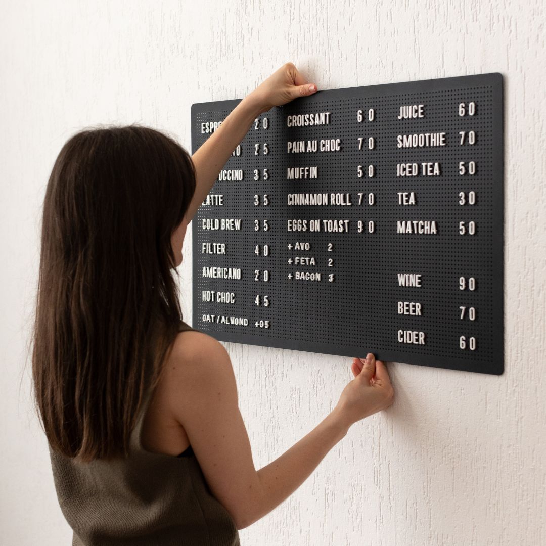
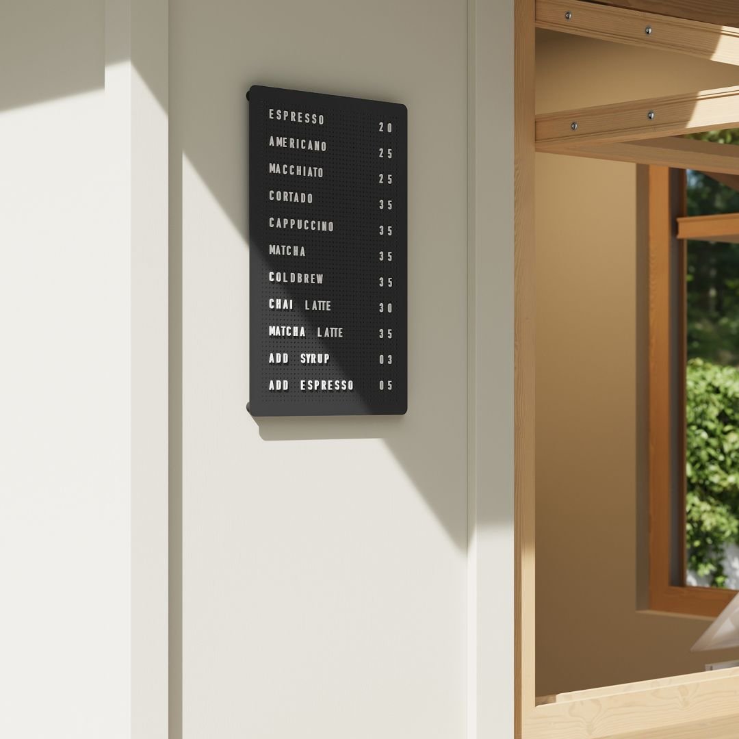
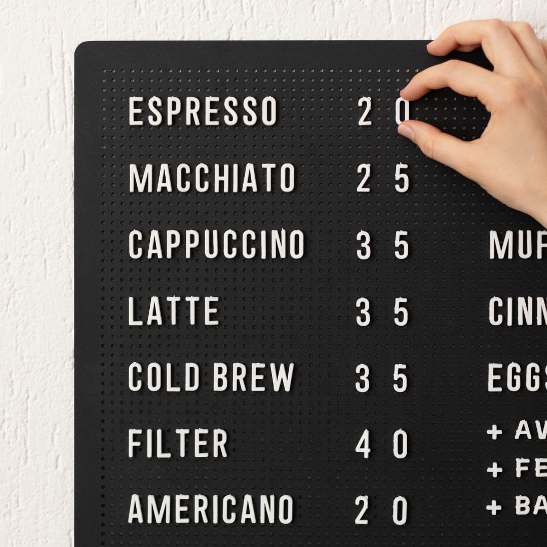
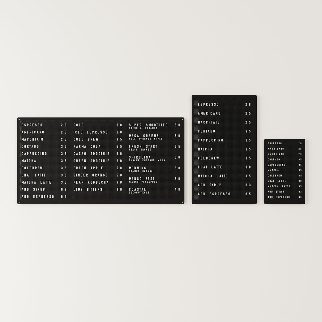
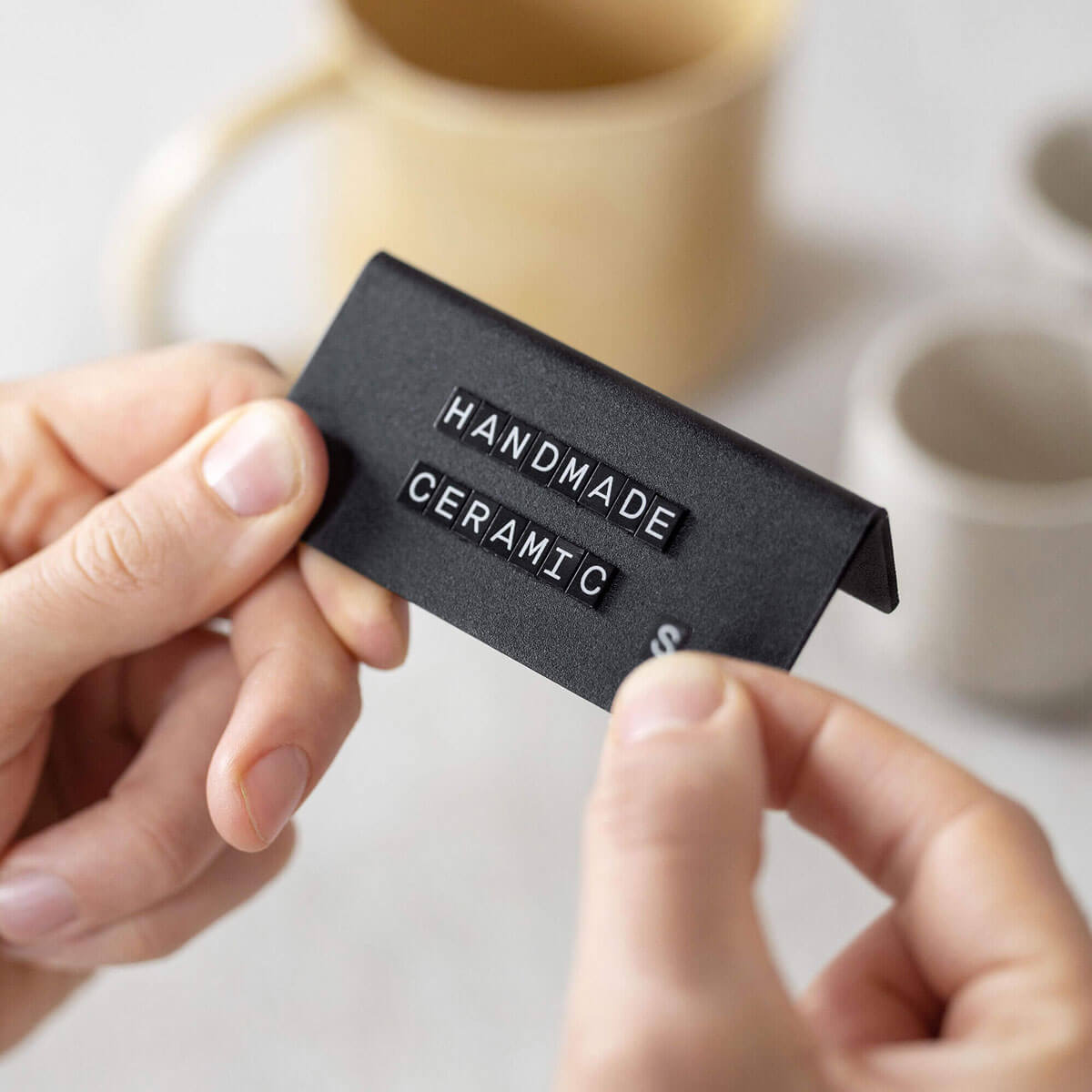
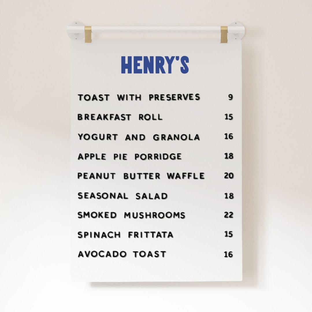
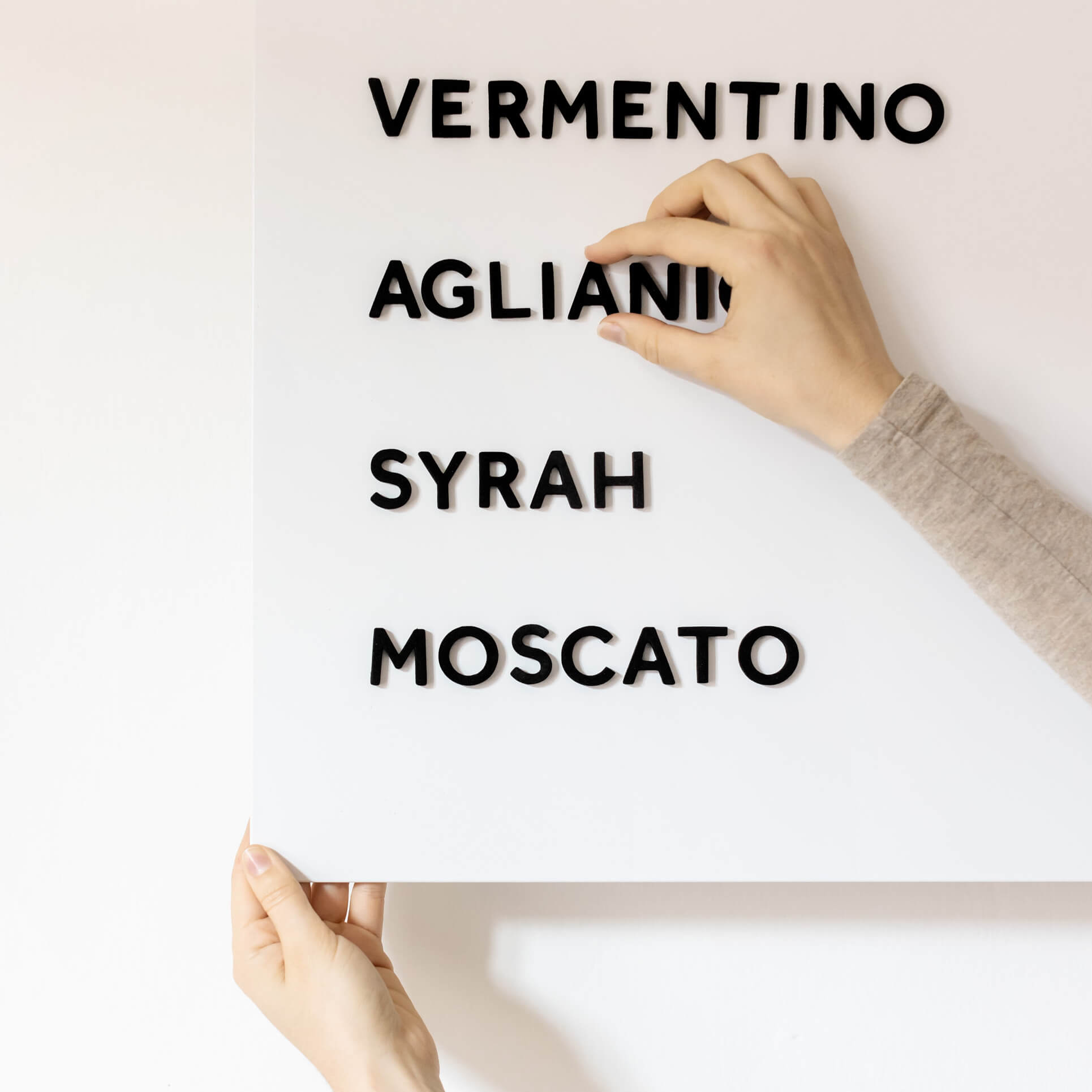
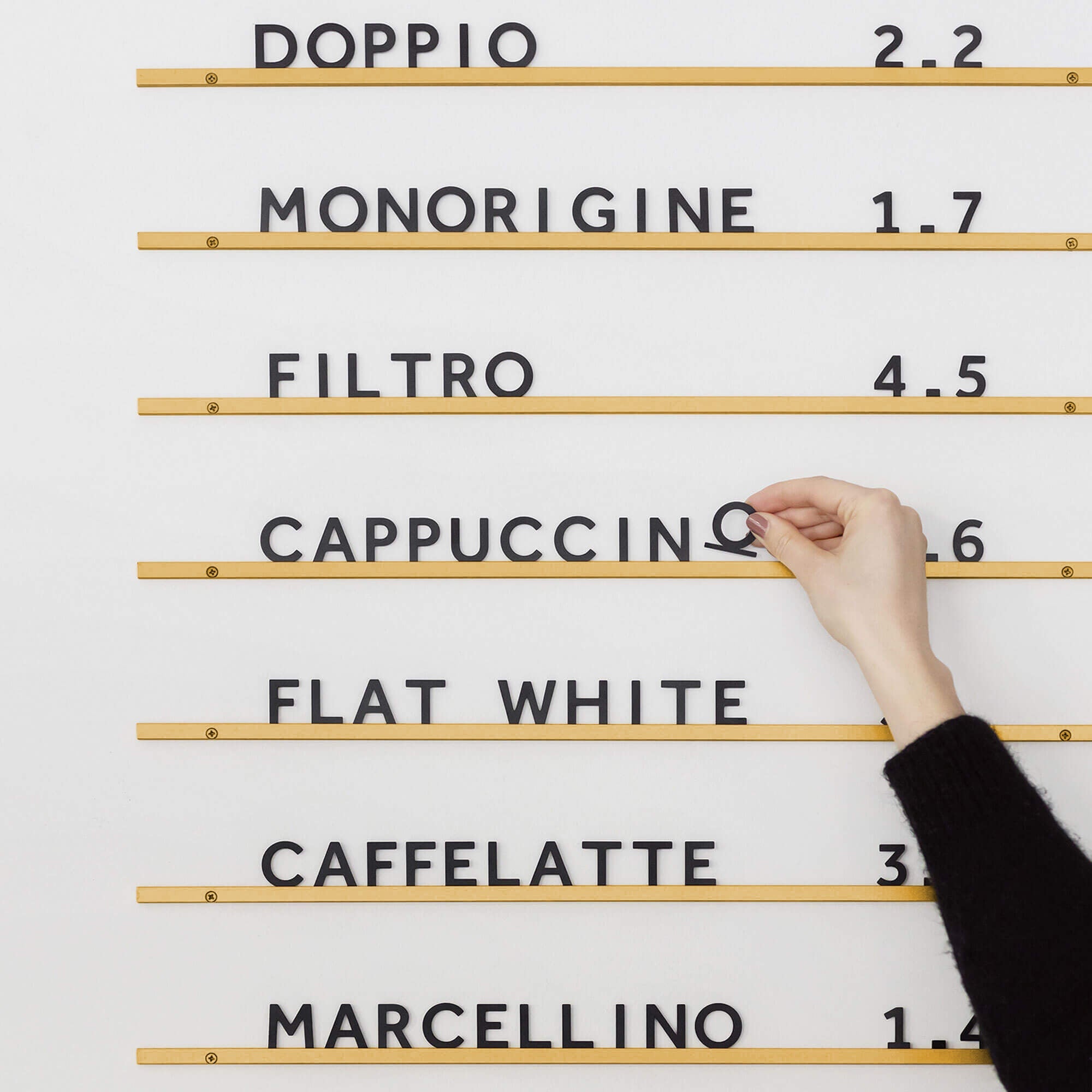
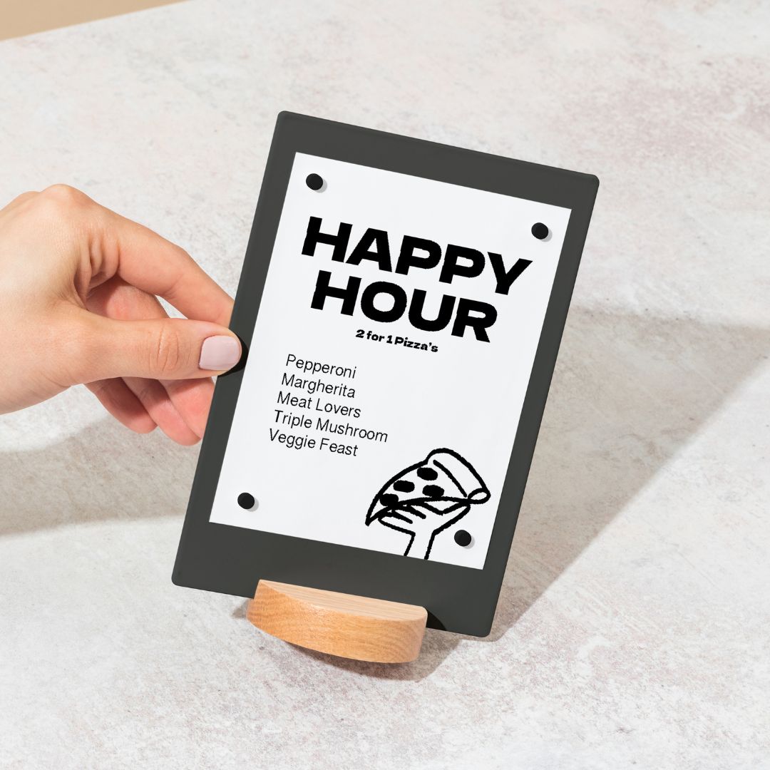
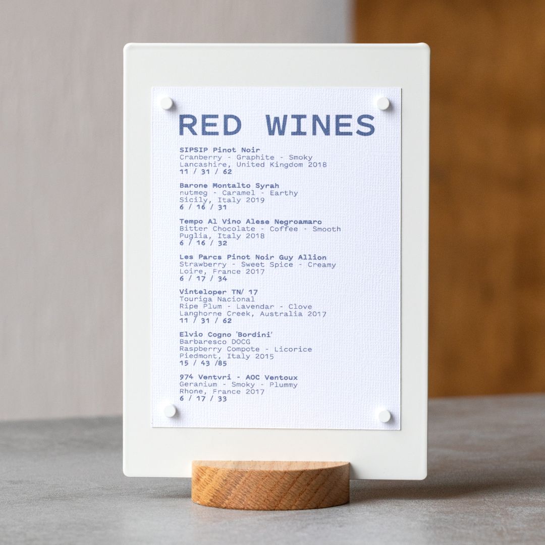
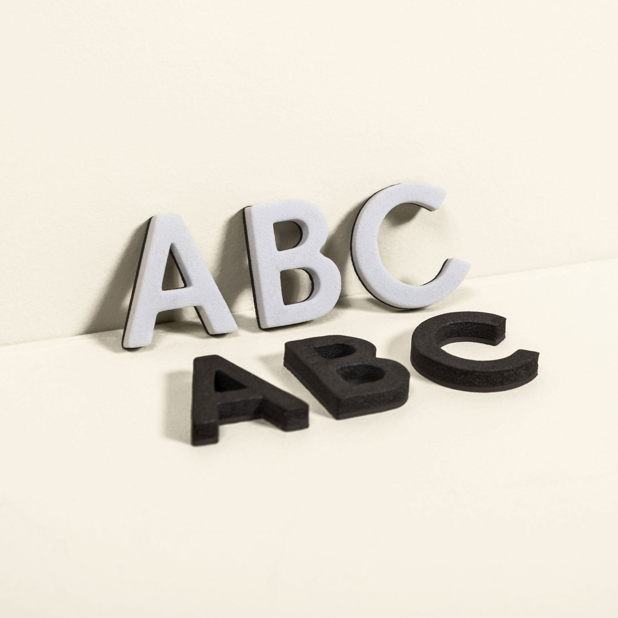
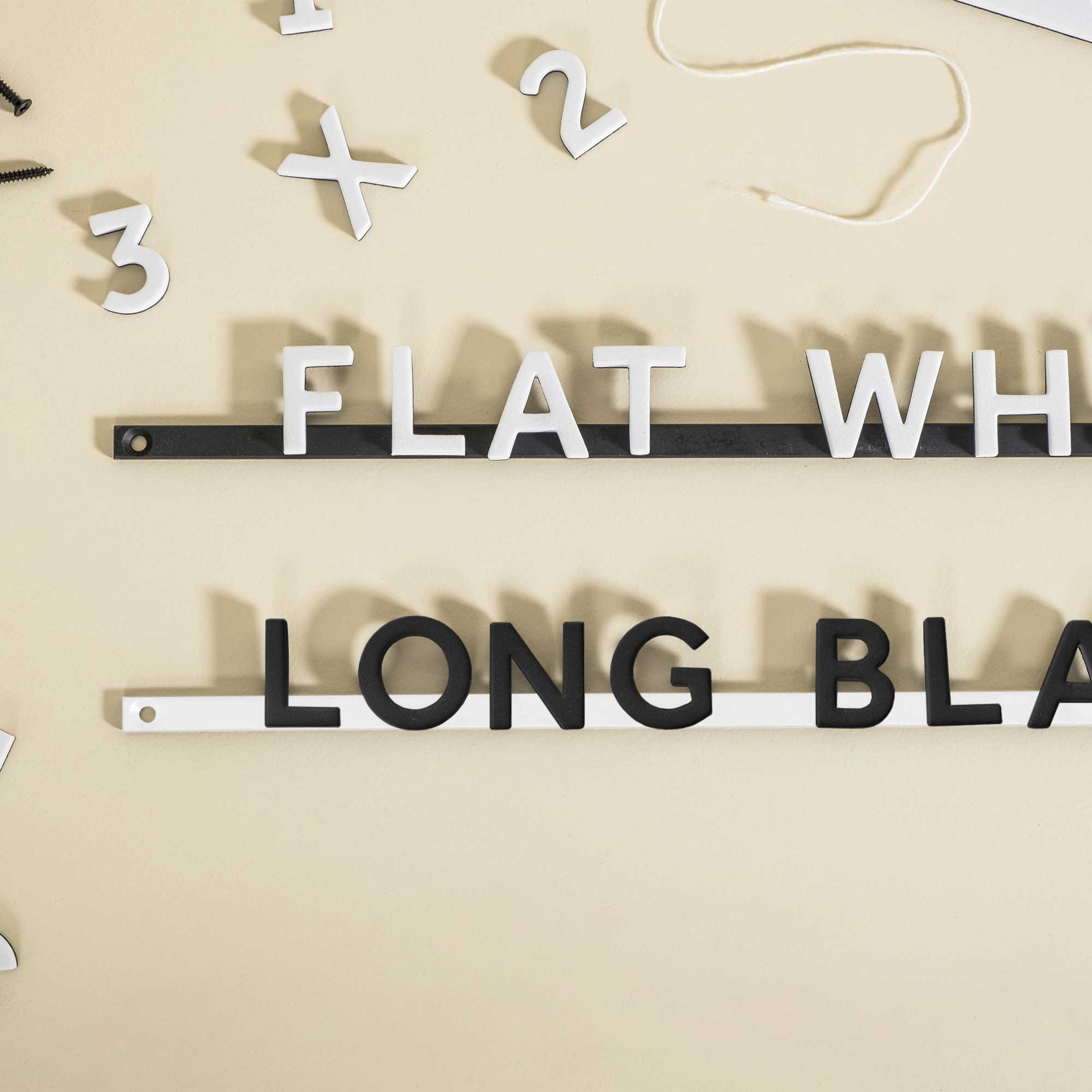
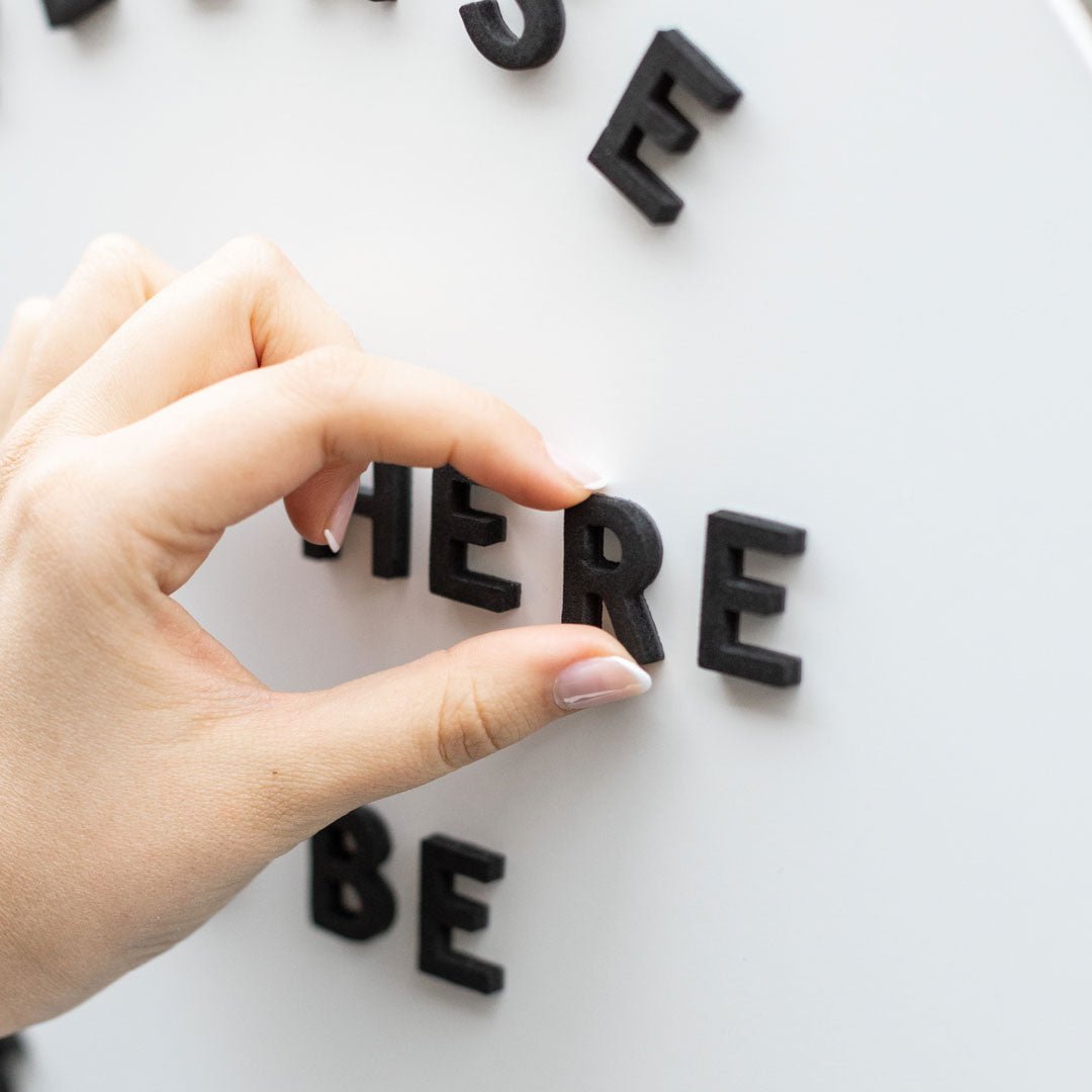
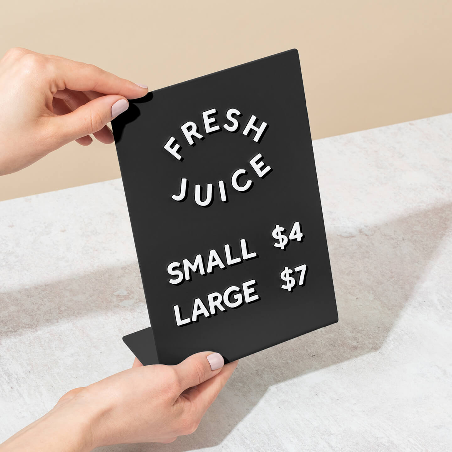
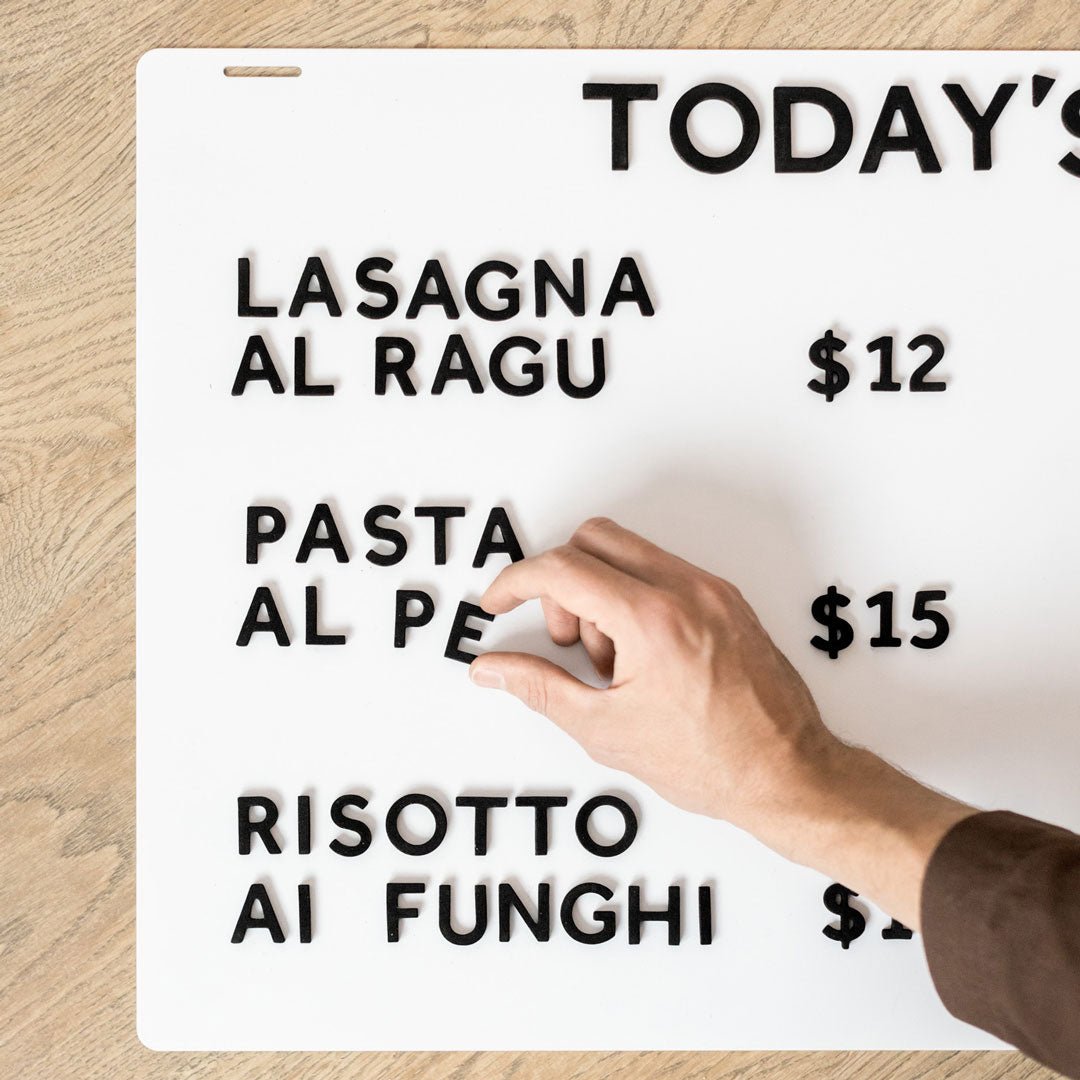
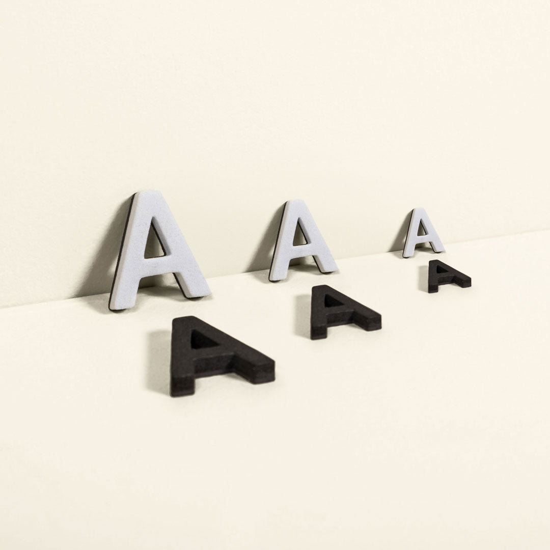
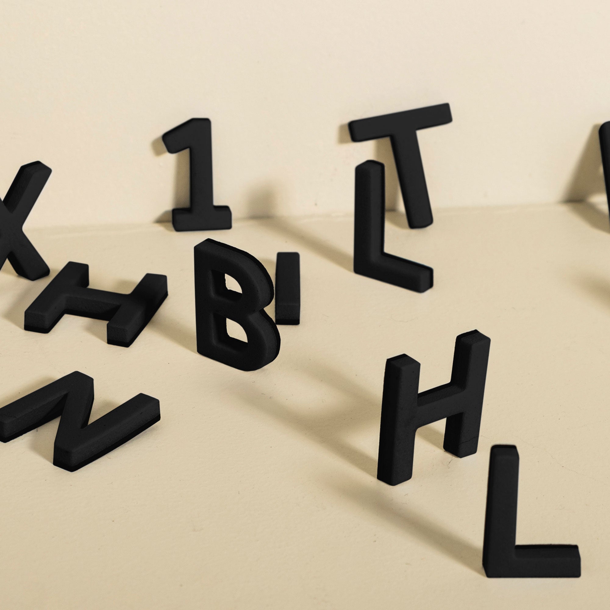
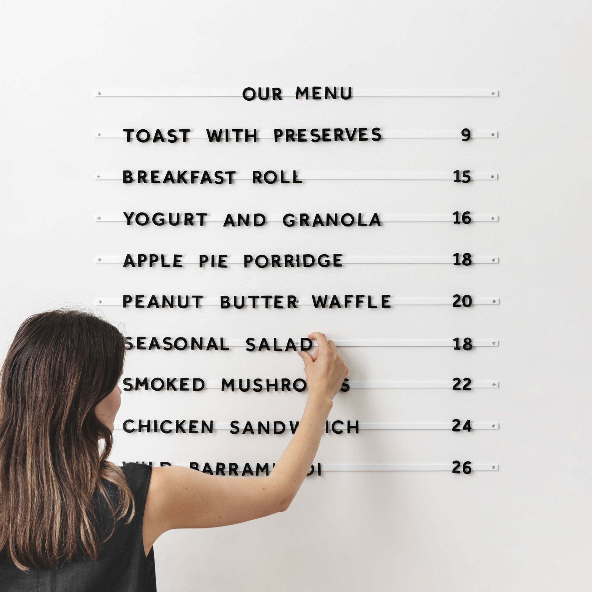
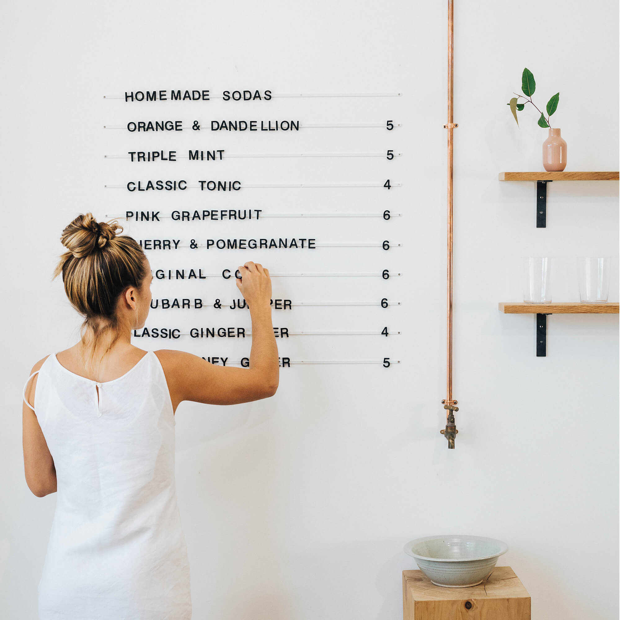
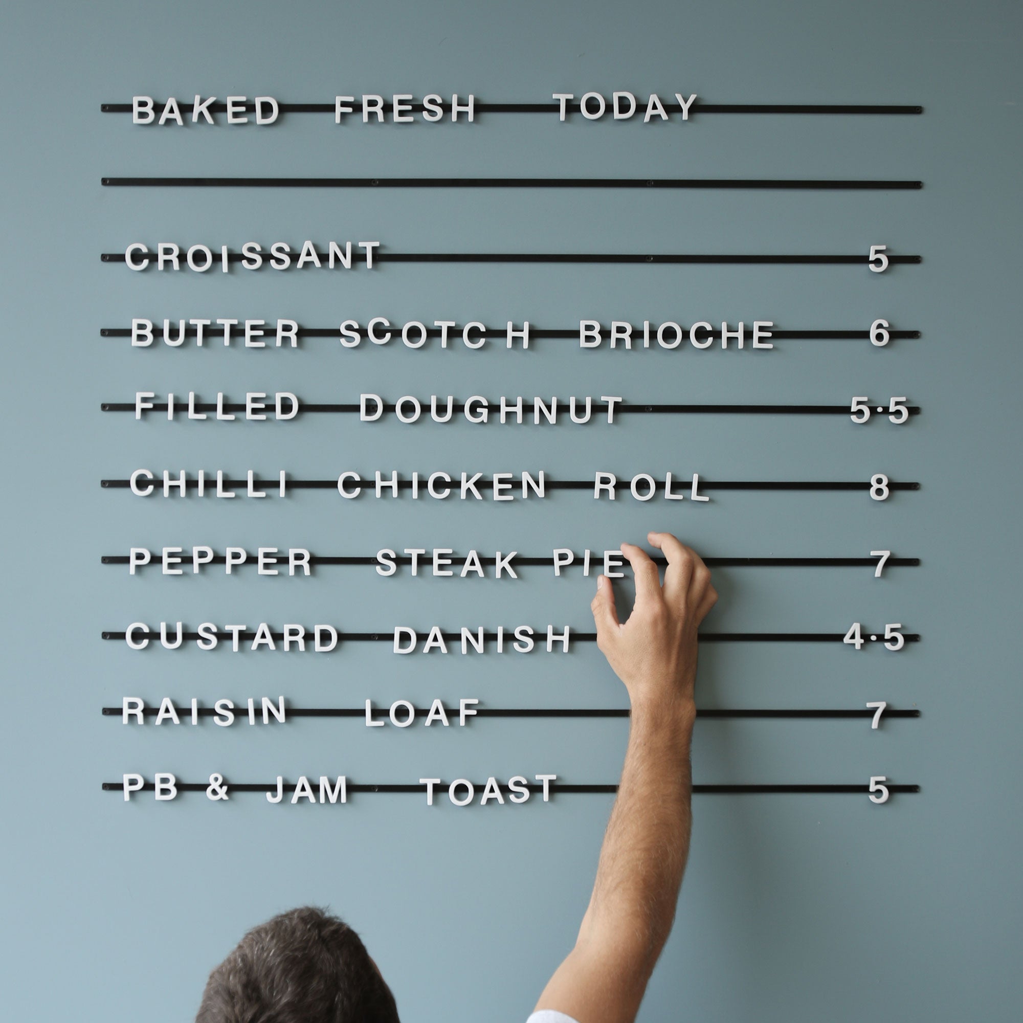
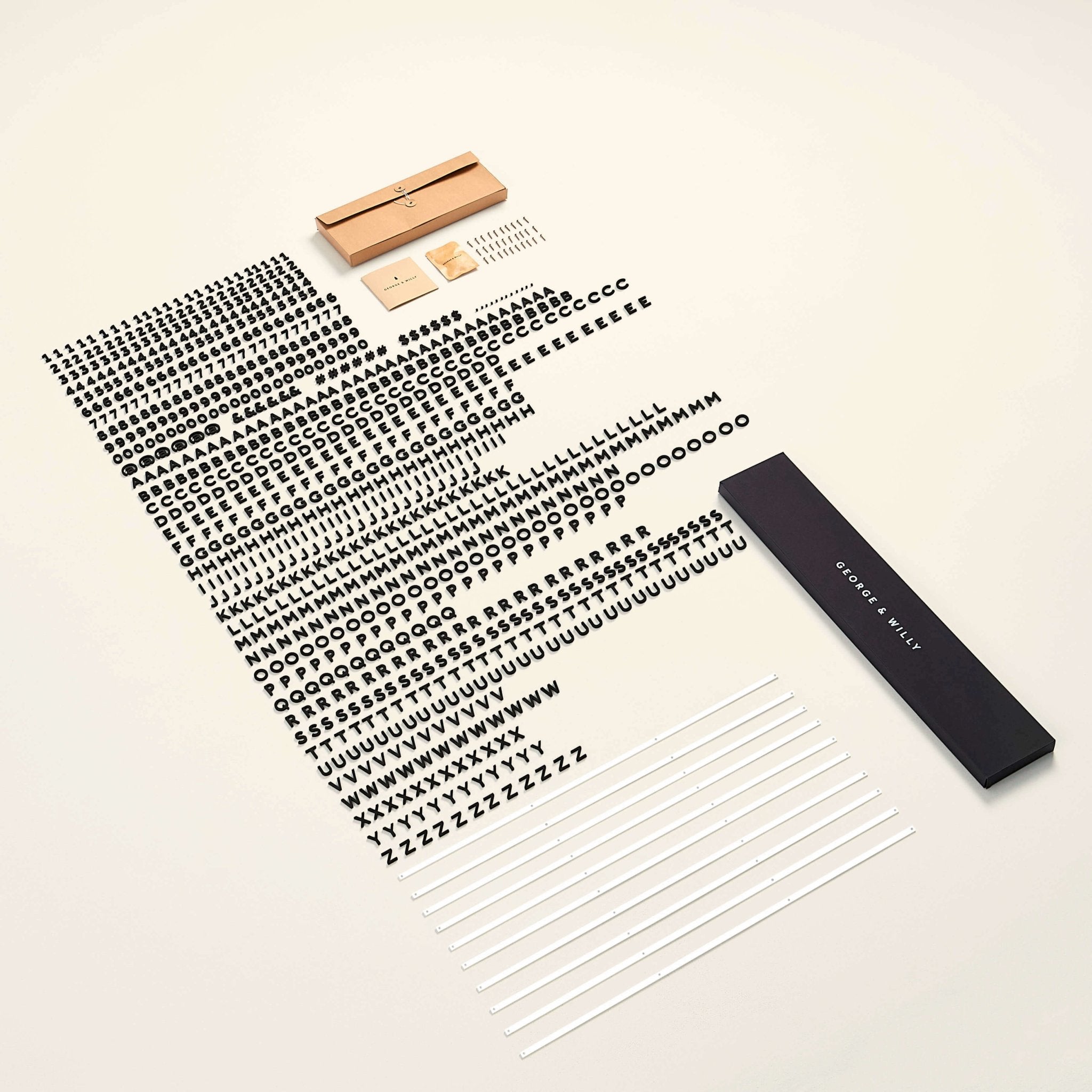
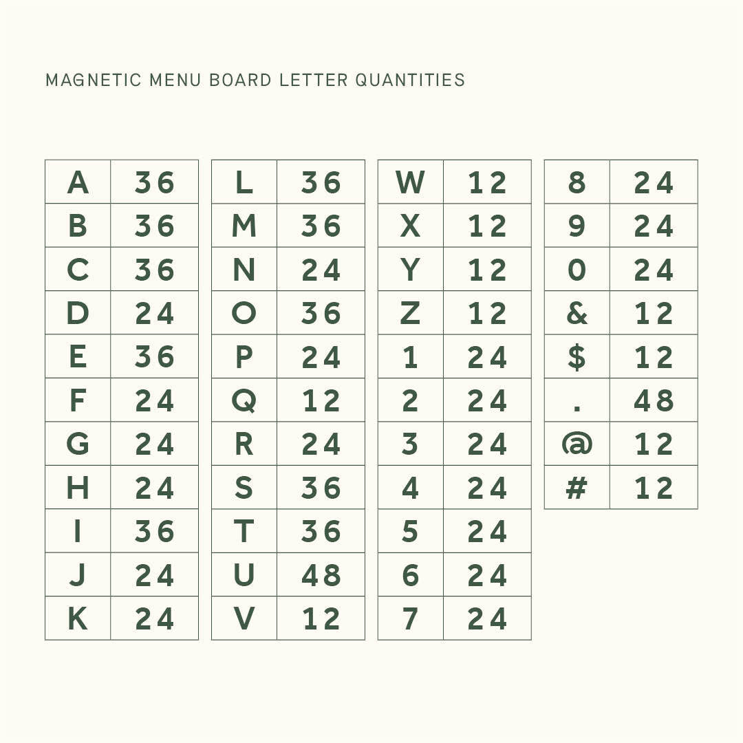
We have always loved the simplicity of this sans serif font and found it a great font for menus. Having a font which is so simple allows it to be used in any style of space. We use this product on our Magnetic Letter Menu.
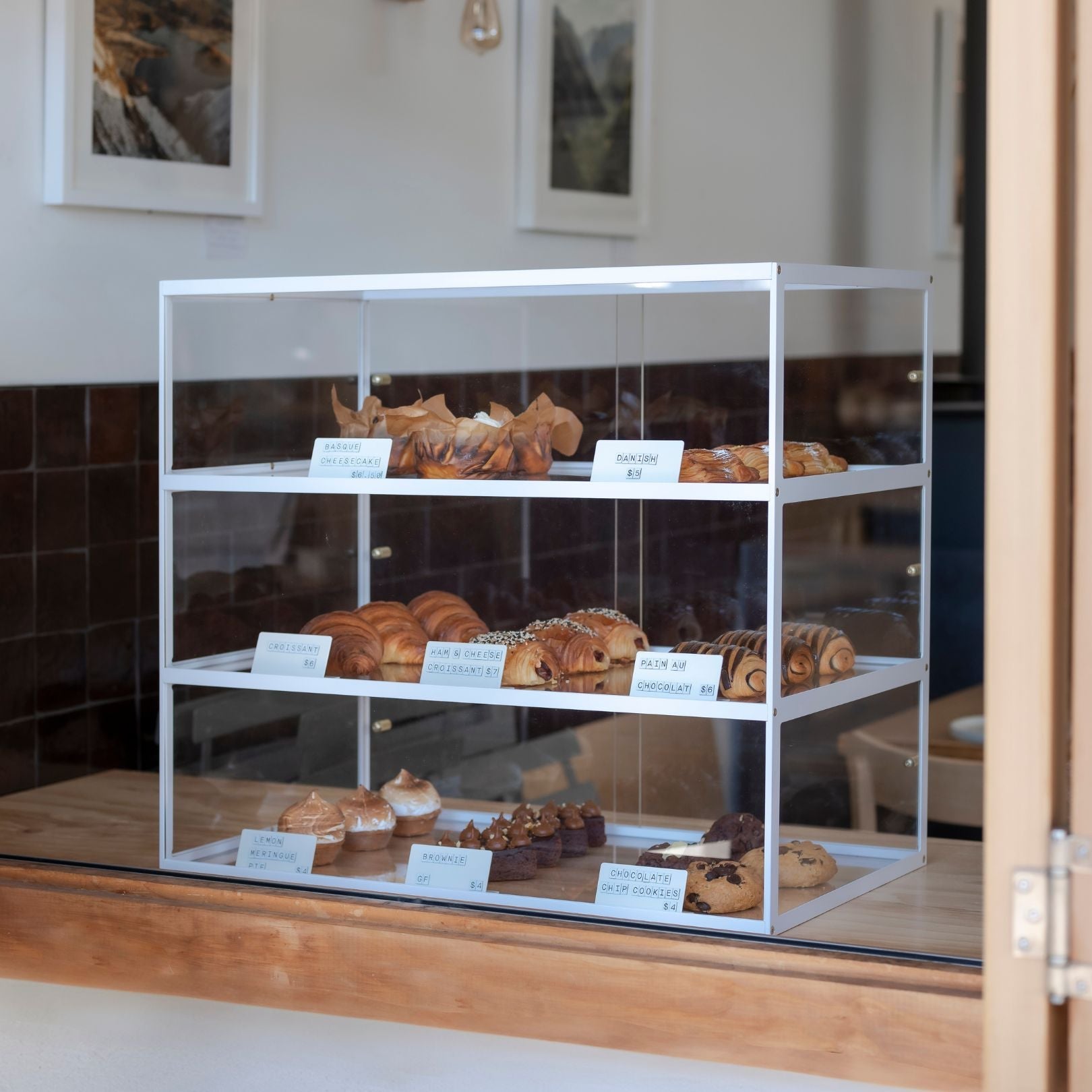
When you look at each individual letter in Effra it is hard to imagine any letter being more simple. It is a very clean font for menus and suits uppercase with a bit of kerning.

Effra Medium on Beer Menu by George & Willy
Pitch Sans
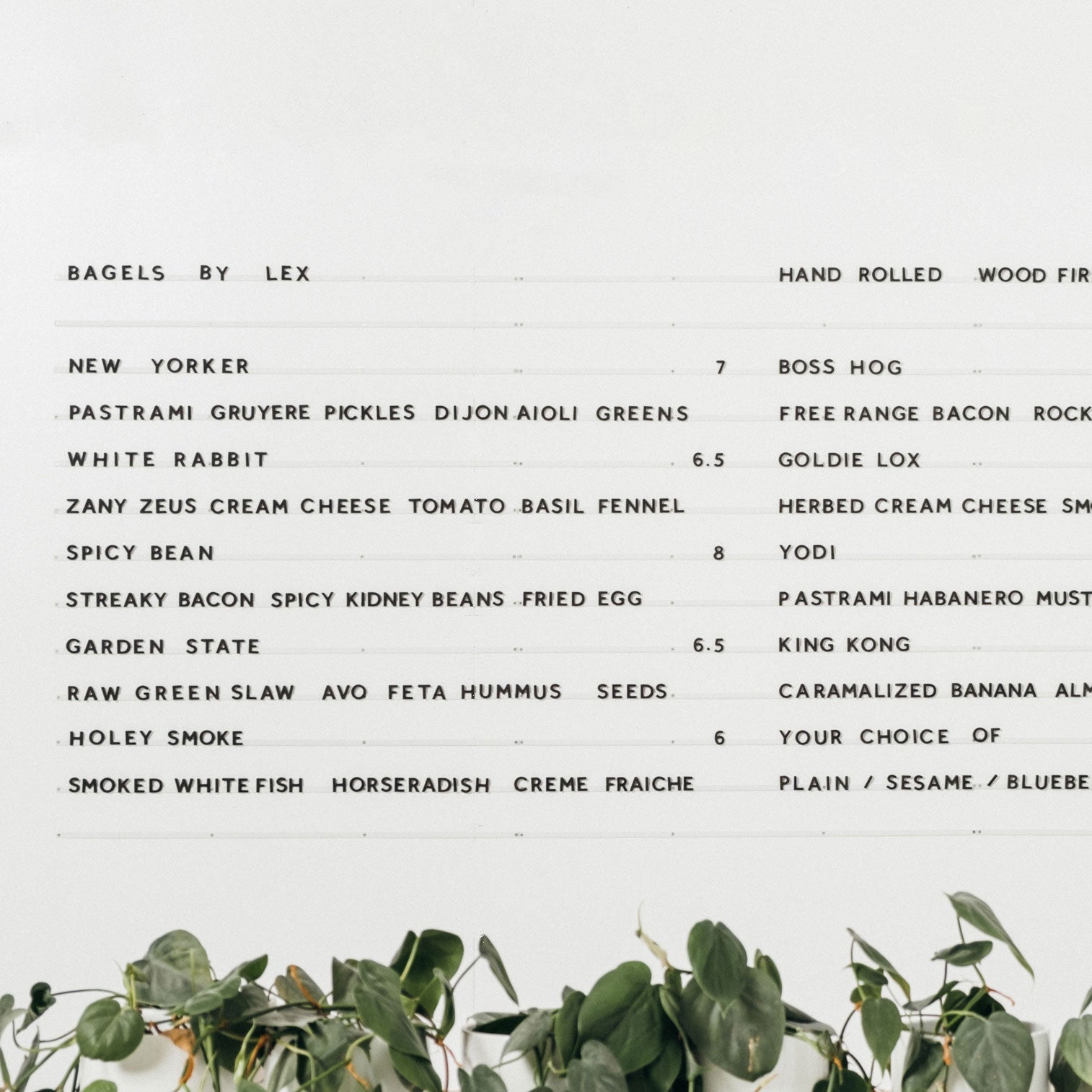
This is a great font for menus - it is a typewriter-style font and the one we use for our branding body text. It is similar to courier but cleaner and sans means it has not serifs (the little tails on all the letters). This looks beautiful on this toast layout and is a great font for a cafe menu.

Pitch Sans on the Lightbox Menu by George & Willy
Maison Neue Mono Regular
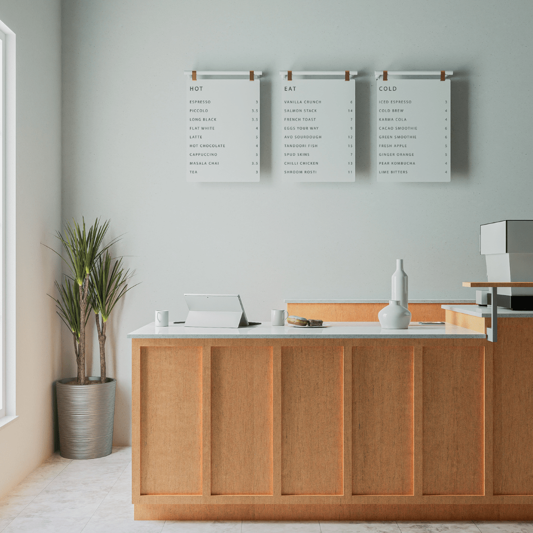
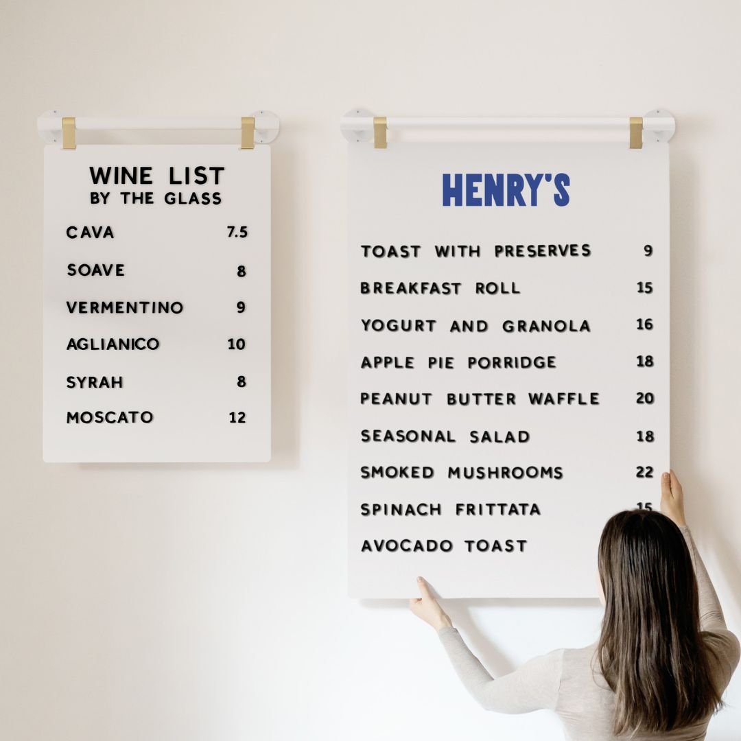
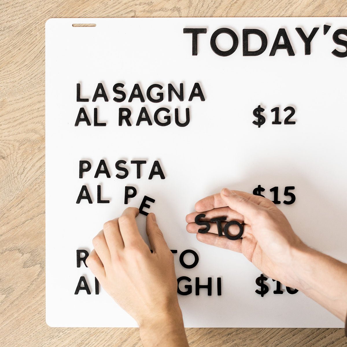
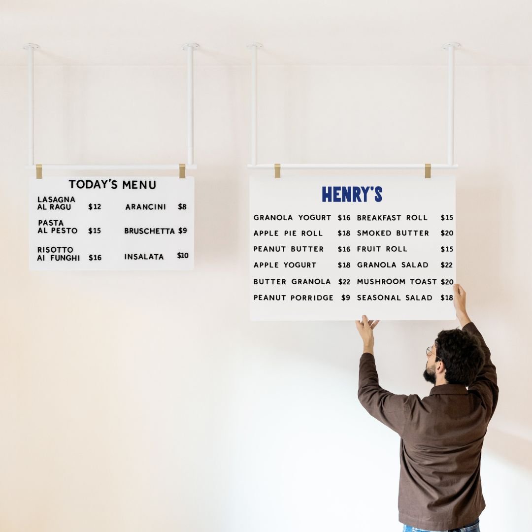
A clean industrial font for menus which we plan to use on our range of industrial style menu boards launching soon. This is currently a personal favorite and if I had a cafe this would be the menu font.

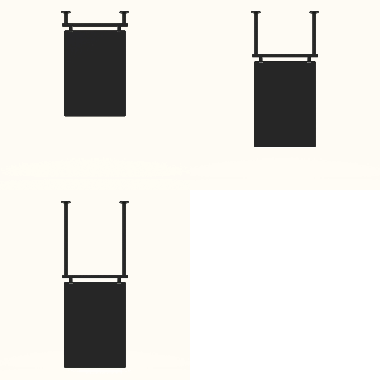
Maison Neue on the Hanging Display Board by George & Willy (coming soon)
PF Din Mono Medium
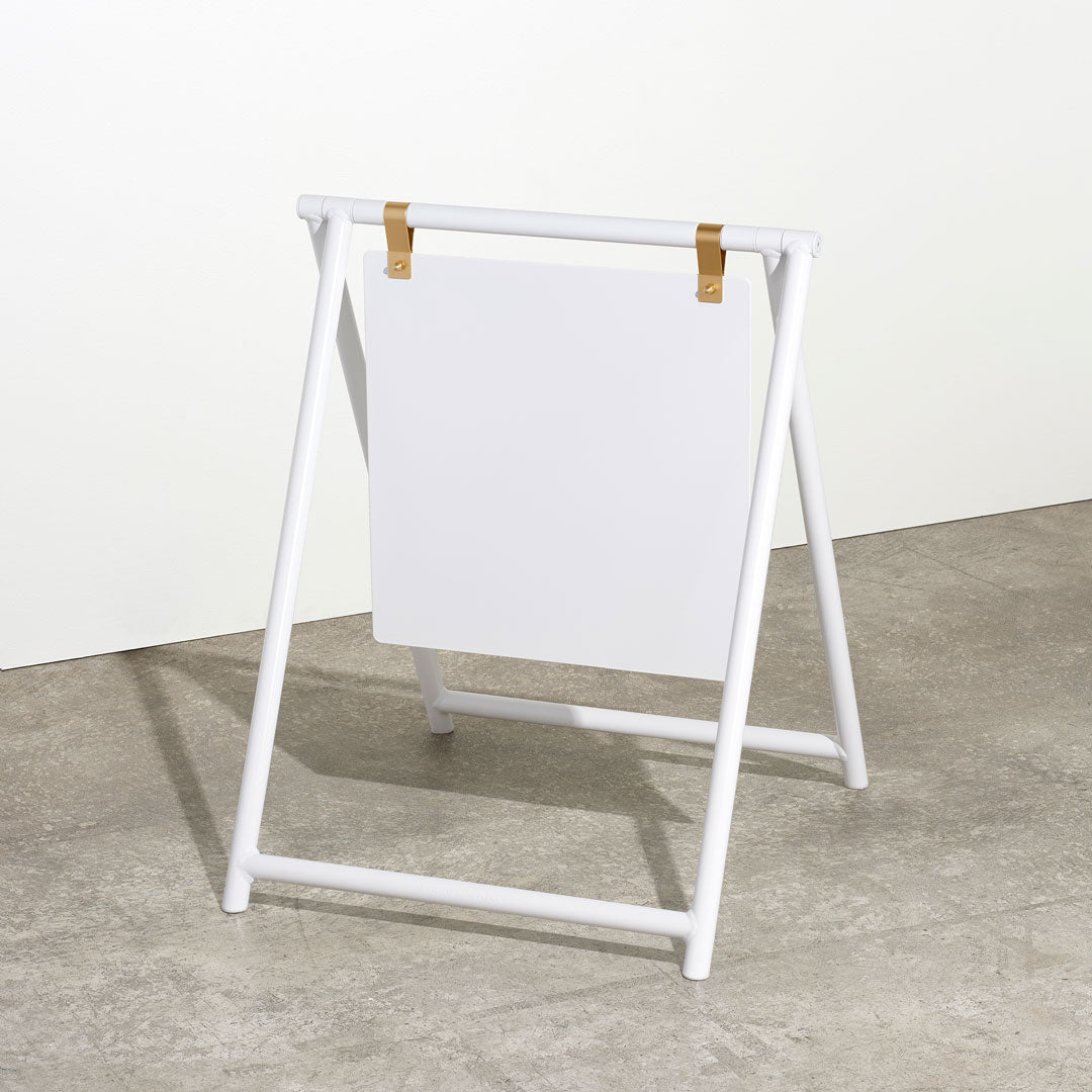
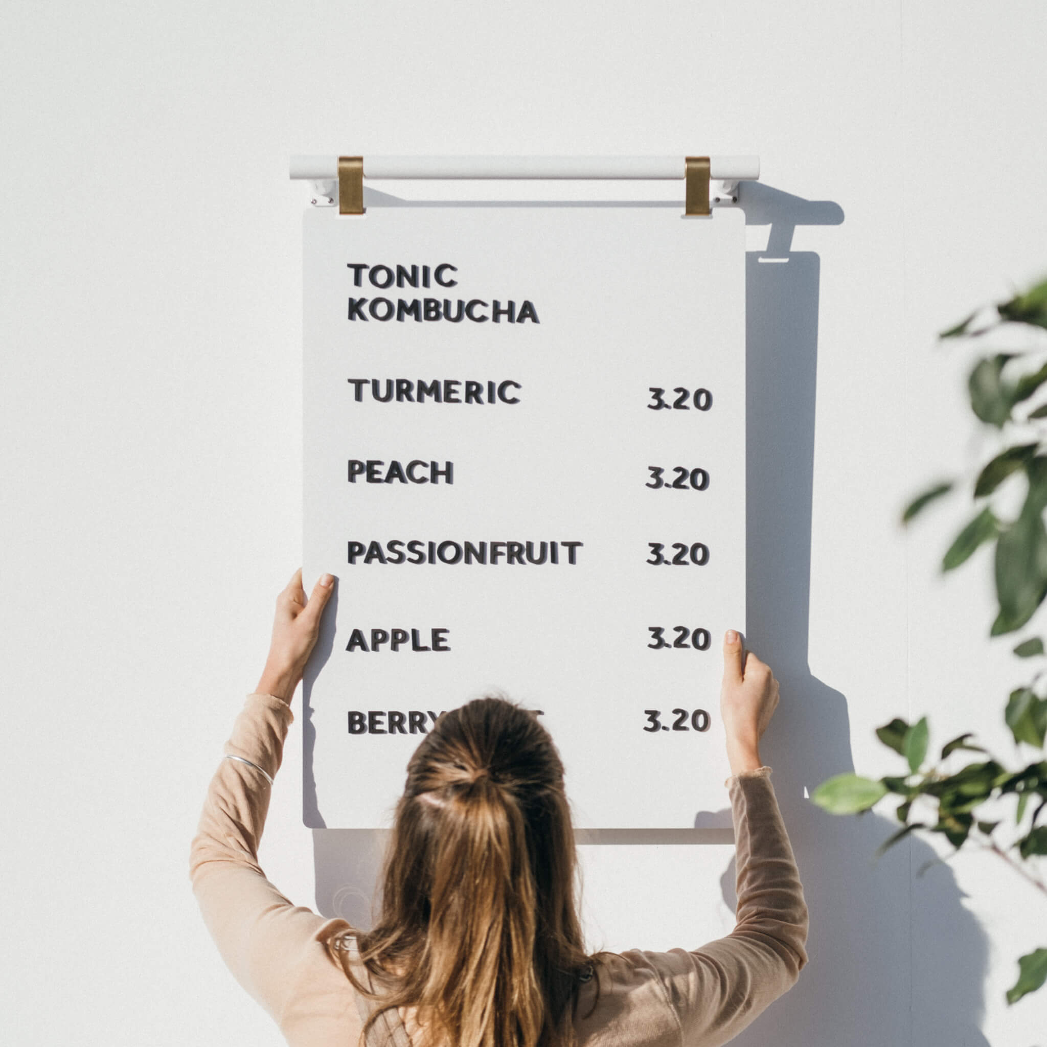
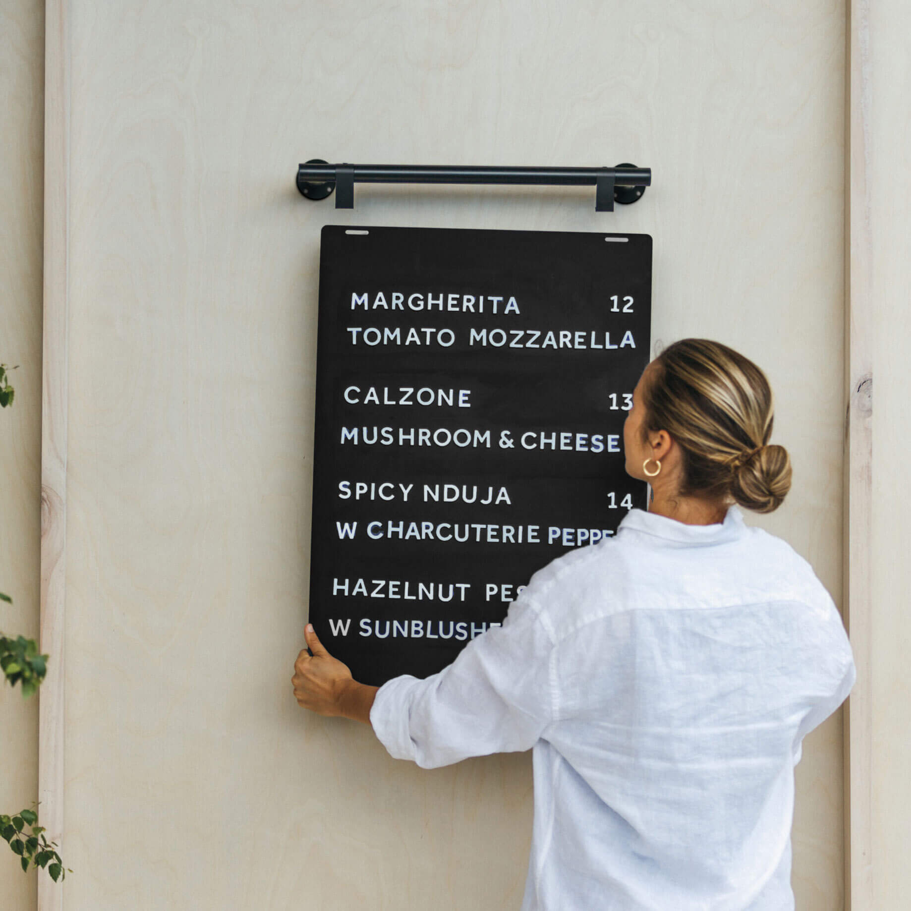
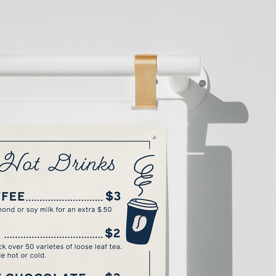
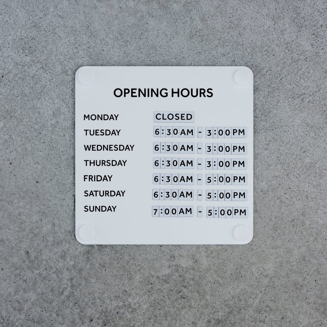
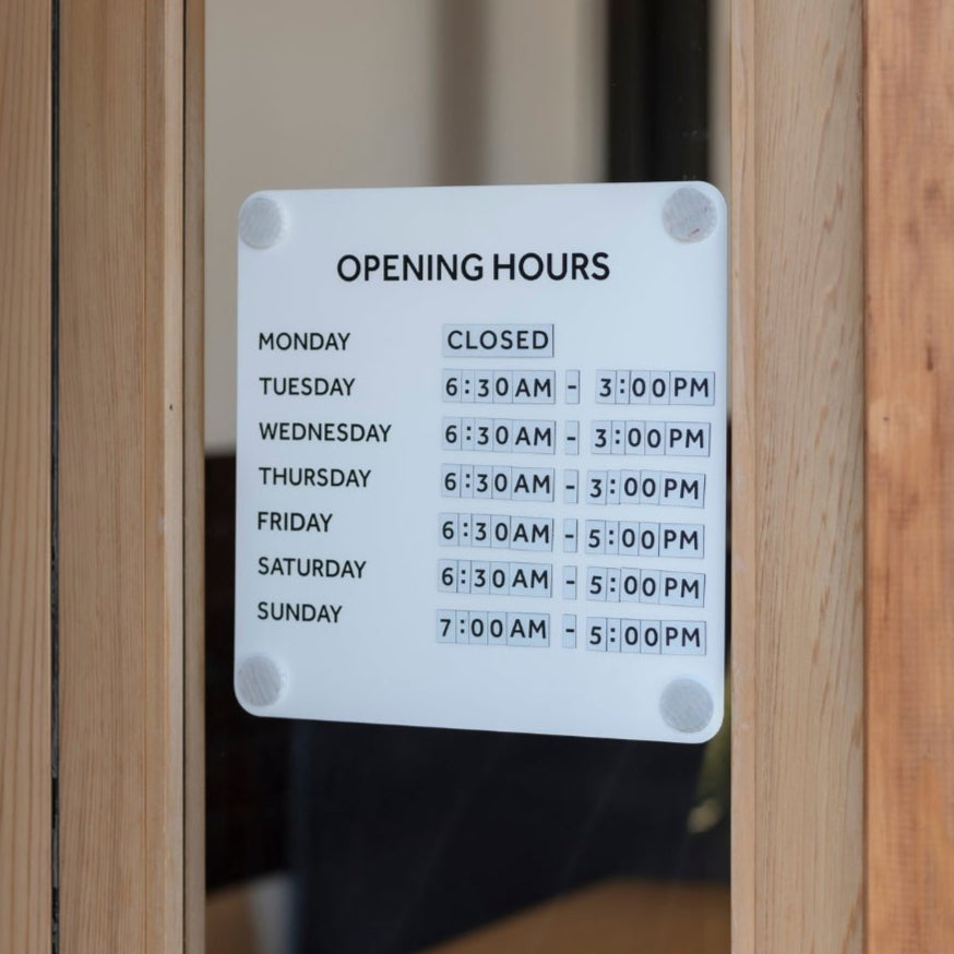
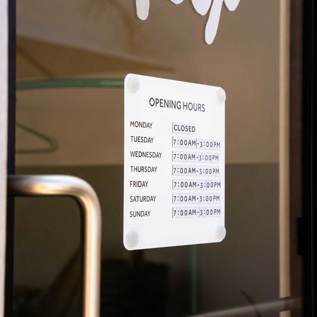
A slightly more brutalist industrial font for menus. We used this typeface on some outdoor signage for a photoshoot.

PF Din on the Hanging Square Sign by George & Willy
There are so many different industrial style fonts which you can use for menus, please have a look around online and also check out this tool to identify fonts which you find online.
We love creating beautiful menus and helping people choose fonts for menus so please get in touch if you would like some guidance or help.


